
Sunday 27 April 2014
Wednesday 9 April 2014

Tuesday 25 March 2014
Drafts
 |
| For one of my drafts I used the idea of a pattern to create a draft suitable for my theme. |

Here i used an black and white theme to create another draft as an idea for my book cover I am creating.

On this draft I used different colour and simple drawings to create this idea for my final design.

I created this using one of my own photos as the key part of the book cover design.


Tuesday 11 March 2014
Artist copy
 |
| Above is an image that I found on Pinterest and below I copied it using the same techniques as the artist. |

Sunday 2 March 2014
Cup Cake Book Cover- analysis


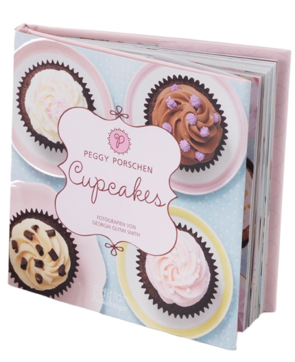
I am analysing the cover of the book ‘Cupcakes’ by Peggy Porschen. I can tell this is a book cover as it contains the conventions of a book, A title, authors name, spine, barcode, front and back cover and the blurb.
The layout of this book is very ordered and well laid out this represents the order of the book as it is an instruction book so its going to be very ordered and clear. The layout of the text is on a strict grid this gives order and makes it all appear clear, whereas the images of the cakes aren’t which gives a more fun and relaxed look to it this shows the relationship between the orderedness of making the cupcakes and also the fun side of it. There is little white space, only on the box that the text is in and the table cloth behind the main image, this gives a crisp professional look and makes it appear busy and exciting without it being ‘too’ much.
The typography used throughout the book design is quite consistent, only two different typefaces are used. The first is a hand drawn type for the name of the book, this represents the handmade cupcakes in the book, it also looks pretty and less simple this could show the way they want the cupcakes to look, pretty and interesting, the names of the book is also obviously the key bit of text because not only does it use the hand drawn type its the largest type on there this will draw the readers attention first. Whereas for the less important text and therefore smaller text its in a more simple sans serif font which is a lot more formal than the hand drawn type used in the title, this font is used for the authors name, photography company and for the review on the back of the book, the sans serif type face is all in capitals this shows the ordered consistency of the information inside the book. A smaller more basic font is used for the institutional information because it is less important than the rest.
The hierarchy on the book cover design is; the first thing on the book that catches the readers is the main images of the cupcakes this is because the rest of the design doesn’t have a lot going on it’s all quite simple also there the brightest thing on there, the rest of the colours used are pastels but the cakes use browns, caramels and pinks. The next thing that catches the reader's eye is the box containing the title, the box an outline which used the same effect as the typeface used for the title, its a pretty swirly effect, this catches the readers eye as the colour is slightly darker than the pastel colour scheme, also the text box appears to be floating on top of the main image this means when you first look at it its the first thing you see. Everything else is what you have to look more closely to see, the author and photographers name this shows the reader that its the less important information and if it was in a large text it wouldn’t make anyone want to pick up the book.
The colour scheme used on this book cover contains lowly saturated colours for all the background colours and text this creates a soft gentle look this also makes it so the more pastel colours used catch your eye last which links in with the hierarchy, wheres as the main image of the cupcakes don’t follow this colour scheme the colours are a lot darker the contrast between the background and the main image creates a good effect it also make the cupcakes to appear a lot bolder this catches the reader's eye and makes it so as soon as we look at the book they know its going to be about baking, I think the contrast in colours also represents the diversity of what is inside to bake.
Graphical ornamentation has been used frequently throughout this book cover, boxes are used for all of the text on the book this is because the background image is very busy and text straight on top wouldn’t be very clear to read by adding a box for all the information it makes it noticeable because the colour scheme is pastel for the colour of the text and the background colours so this straight on top of each other would be too similar and therefore not clear to the reader, the box makes it clear that the information is important without having to compromise on the colours of the main image.
All of the institutional information such as the barcode, publishers information and price is hidden at the back in a very small font size and in a colour that isn’t very clear against the background, this is because this information isn’t very important and won’t really interest the reader and its only there because it has to be so you don’t want it to be the center of attention on the book cover as it would ruin the whole look and design of it making it less appealing to a buyer.
Friday 28 February 2014

Subscribe to:
Posts (Atom)